Pushing Kodak Portra 160 Film to 320 (with Sample Photos)
Hi Everyone, In this blog post I will share with you my experience with shooting Portra 160 and pushing it to 320.
If you are like me, you like to experiment with new mediums all the time. The beauty of film is that It challenges that instant gratification of digital photography and require more critical thinking and it makes you work harder to get the result you want.
With only 36 shots available (even fewer if you are shooting 120 or 220 film!), every time you press the shutter, you are spending about 2€!

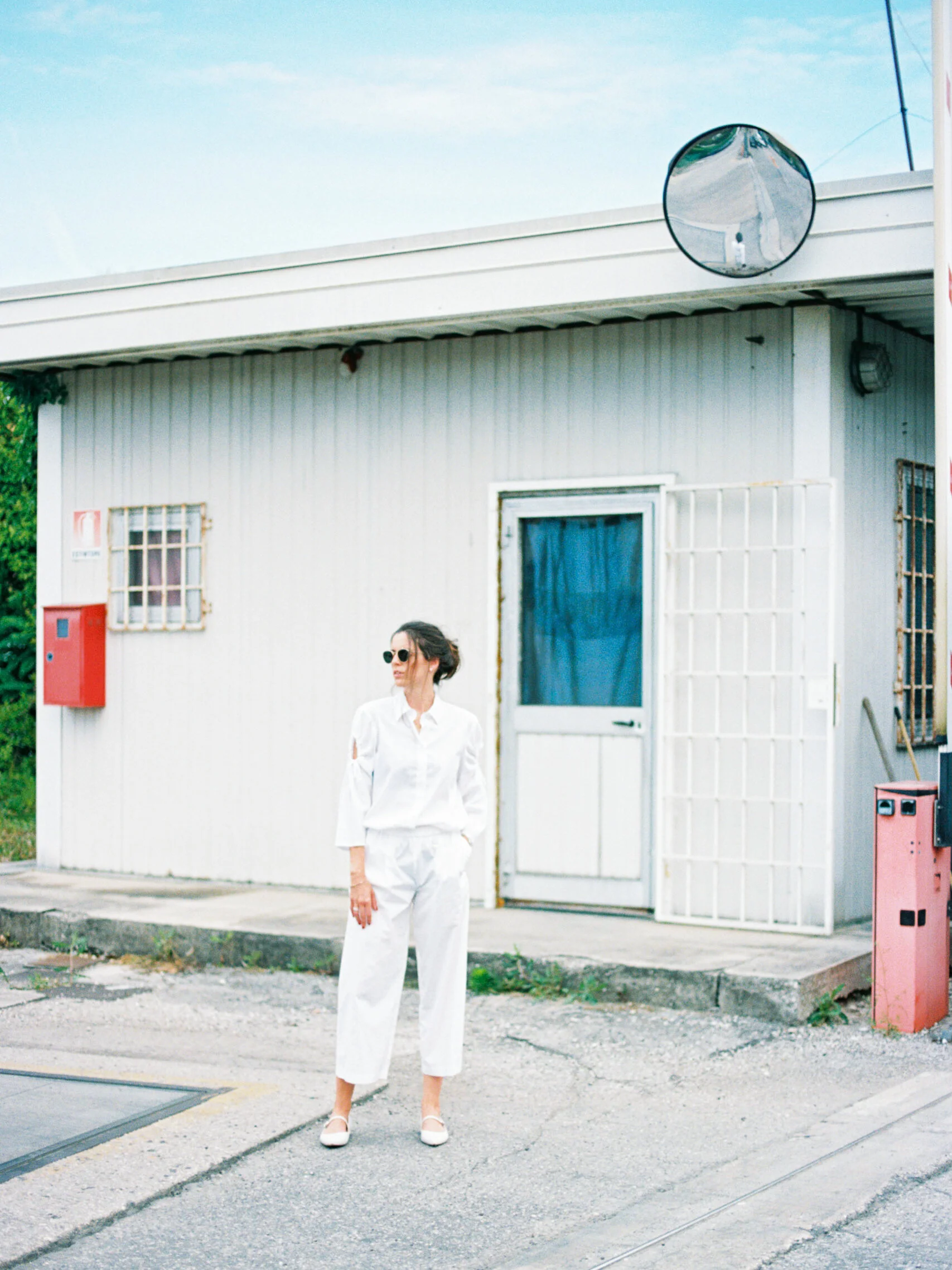
Image shot on a Canon 50e, 50mm 1.4 at 1.4. Portra 160 pushed +1 stop, Frontier Scanner


Why choosing Kodak Portra 160?
I’m not going to lie, the only reason I picked this film stock, was because they run out of Portra 400 at my local camera store. :) Portra 400 is reliable and flexible, has great tones, and can be used in a variety of different scenarios. Portra 160, on the other hand, is much more limited in terms of usage (unless it’s a sunny day or you are shooting with strobes, 160 ISO is not going to be enough sensitivity, at least for me).
The beauty of film is the fact that you can, potentially, underexpose it by 1 or 2 stops, and ask your lab to “push it” in the developing process. What this means, is that they will keep the roll of film longer in the developing chemicals. This raises the exposure and gives more punch\colors, contrast, and grain to the negatives.
The best qualities of Kodak Portra 160 are natural, warm colors, fine grain, and good sharpness. These aspects make it the perfect choice for commercial or studio work!
I think Portra 160 is a great “summer” film, because of its warmth and rich colors.
If you prefer a little more character and “style” though, I think you’ll have to look further.
You are looking for that nostalgic film look? My choice would be Kodak Colorplus 200, Fujifilm C200, Kodak Gold 200 or Ultramax 400.
If what you are after is great quality, consistency, and a high-end look, I recommend Kodak Porta 400, or Portra 800. They look professional while having a distinctive aesthetic!
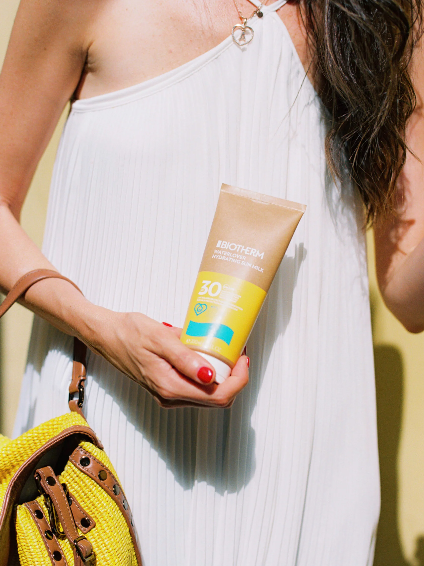
Image shot on a Canon 50e, 50mm 1.4 at 1.4. Portra 160 pushed +1 stop, Frontier Scanner
Pushing Kodak Portra 160: my thoughts
As mentioned earlier, pushing ANY film, will change its structure and look. It’s expected to see a color shift and more contrast\saturation.
My experience with pushing Kodak Portra 160 was relatively good. I’m not mad at the results, however I don’t think I’ll be using again this combo.
The colors are rich and beautiful, but I feel like skin tones are a little too hot and saturated, almost red.
Another element I didn’t particularly enjoy was the inconsistency, this might be due to a number of different factors, such as quality and color of light. Keeping in mind I was using an external light meter (a Sekonic l-358), my exposures were pretty consistent. However, some images are more contrasty than others, some have very cool shadows and some have wanky skin tones.
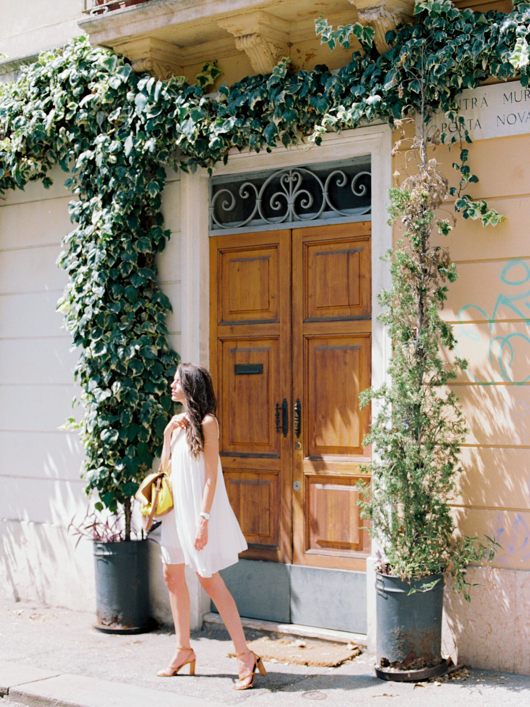
Canon 50e, 50mm 1.4 at 1.4. Portra 160 pushed +1 stop, Frontier Scanner